Designing Inclusive Exhibition Graphics: Accessible Wayfinding and Promo Assets for Queer Spaces
A practical checklist for accessible exhibition graphics, wayfinding, and promo assets for queer spaces—grounded in community needs.
Designing Inclusive Exhibition Graphics: Accessible Wayfinding and Promo Assets for Queer Spaces
Inclusive exhibition graphics are not just a visual layer on top of an event. In queer spaces, they are part of the welcome, part of the safety plan, and part of the cultural story you are telling. When signage is readable, wayfinding is intuitive, and promo assets reflect the real community you want to reach, the design does more than inform people. It helps them decide, often in seconds, whether a space feels emotionally and physically safe enough to enter. That is why the most effective systems borrow from community-first institutions like Leslie-Lohman, where display, access, and belonging are treated as interconnected rather than separate.
If you are building an exhibition identity from scratch, start by thinking like a publisher and a host at the same time. You need the clarity of a social-first visual system, the practicality of monitoring analytics during beta windows, and the flexibility of repurposing early access content into evergreen assets. Exhibition graphics live in the real world, where audiences arrive with different reading speeds, different devices, and different confidence levels. That makes inclusive design less like decoration and more like interface design for physical culture.
This guide gives you a practical checklist for accessible wayfinding, exhibition graphics, and promotional materials for queer audiences. You will get a step-by-step framework for legibility, language, placement, color, motion, and outreach, plus a comparison table, pro tips, and a FAQ. The goal is to help creators, curators, and community publishers produce assets that are beautiful, culturally relevant, and genuinely usable.
1) What Inclusive Exhibition Graphics Need to Do in Queer Spaces
At a minimum, exhibition graphics must tell people where to go, what to expect, and how to participate. In queer spaces, there is usually a fourth job: signaling that the space understands community nuance rather than flattening it into generic rainbow branding. That means your graphics should not only identify rooms, entrances, restrooms, ticketing, and programming, but also communicate tone, accessibility support, and the social codes of the event. When these elements align, visitors spend less energy decoding the space and more energy engaging with the work and each other.
Wayfinding is emotional infrastructure
Good wayfinding reduces anxiety before a person has even crossed the threshold. A first-time visitor who can quickly find the entrance, check-in, quiet room, seating, and accessible restroom is more likely to stay longer and participate more fully. This is especially important for queer audiences, where many guests may already be scanning for cues about whether they will be affirmed or overlooked. Clear directional systems can function like a calm voice in a loud room, turning uncertainty into confidence.
Promo assets should mirror the lived audience
Promotional graphics fail when they use stock imagery, generic slogans, or over-stylized type that obscures meaning. Your social posts, posters, email headers, and event banners should reflect the actual community you want to reach, not a vague idea of inclusivity. For audience alignment, study how creators package a message around culture without flattening context, as in packaging creator commentary around cultural news. In queer exhibitions, the same principle applies: be specific about the people, histories, and aesthetics you are honoring.
Accessibility and cultural relevance are not trade-offs
Teams sometimes assume that accessible design will dilute artistic identity, but the opposite is usually true. Accessible systems tend to clarify hierarchy, reduce clutter, and strengthen content structure, which often makes the overall brand feel more deliberate. Cultural relevance also improves when you have fewer gimmicks and more intention. If your exhibition identity is grounded in community language, readable layouts, and audience-first planning, it will feel more sophisticated, not less.
2) Start With the Audience Journey: From Discovery to Doorway to Gallery
The strongest exhibition graphics are built from the audience journey, not from a mood board alone. Think about how someone discovers the event, decides whether to attend, navigates the neighborhood, finds the entrance, and moves through the galleries. Each of those moments requires a different design decision, and each one can either reduce friction or create it. A practical checklist begins by mapping those moments before choosing colors, typography, or print formats.
Discovery assets need clarity at thumbnail size
Most people will first encounter your event on a phone, often while scrolling quickly. That means the poster or social tile has to work at tiny sizes, with a concise title, high contrast, and one unmistakable focal point. If the design relies on dense text, subtle gradients, or clever but vague symbolism, it may look compelling in a studio file while failing in the feed. For scalable content planning, it helps to think like teams that turn early work into durable systems, similar to beta-to-evergreen asset strategies.
Arrival and entry need orientation, not spectacle
At the doorway, the job changes from persuasion to orientation. Visitors need to know they are in the right place and how to proceed without asking staff to repeat directions five times. Signage should place the most important information at the top of the visual hierarchy: event name, entrance, hours, accessibility notes, and immediate directional prompts. This is one place where borrowing from frictionless airline experience design can be useful, because premium hospitality often depends on invisible clarity rather than dramatic flourishes.
Inside the exhibition, navigation should feel continuous
Once guests are inside, the system should maintain continuity from print to wall to screen. Room names, arrows, timelines, captions, and sponsor marks should share a common logic so people do not have to relearn the system at every turn. That same continuity helps volunteers and staff answer questions faster, which matters during peak traffic. If the signage architecture is consistent, the exhibition feels calmer and more thoughtful, even when it is busy.
3) Accessibility Checklist for Legibility, Contrast, and Placement
Accessibility is not a single rule; it is a set of practical decisions that stack together. You need to consider typography, color contrast, physical placement, motion, lighting, reading distance, and translation. The best way to manage this is to use a checklist that your design team can apply to every asset. Below is a comparison table that translates those decisions into action.
| Design Area | Good Practice | Common Mistake | Why It Matters | Quick Test |
|---|---|---|---|---|
| Typography | Large, clean sans serif or highly legible serif with clear spacing | Decorative typefaces for body copy | Readability improves for low-vision and mobile users | Can you read it at arm’s length in 3 seconds? |
| Contrast | Strong foreground/background contrast | Soft pastel-on-pastel combinations | Contrast supports color-blind and low-light viewing | Check at grayscale and from a distance |
| Hierarchy | One main message per panel or post | Too many competing headlines | Reduces cognitive load | Cover the design with your hand; does the main action still appear? |
| Placement | Signage at decision points and eye level | Hidden signs behind people or décor | Placement affects whether wayfinding actually works | Walk the route as a first-time guest |
| Motion | Short loops with pauses and readable frames | Fast flashing or constantly moving text | Safer for neurodivergent guests and motion-sensitive viewers | Watch on mute from across the room |
A useful benchmark is to design for the least convenient viewing scenario first. That means a person may be outdoors in daylight, indoors under dim gallery lighting, looking at a phone with reduced brightness, or moving while trying to read the sign. A good system still works under those conditions. This mirrors the logic behind choosing tools and workflows that behave well across contexts, like cross-device workflows and data-driven user experience decisions.
Typography rules that protect readability
Use fonts with clear letterforms, generous spacing, and strong differentiation between characters such as I, l, and 1. Avoid compressing line height or tracking so tightly that the text becomes a visual block. For headlines, you can be expressive, but the supporting information must remain stable and easy to parse. If you need to test type quickly, print the design at actual size and read it from several distances in the lighting where it will be displayed.
Color rules that respect reality
Color should support hierarchy, not replace it. Many exhibition teams love immersive palette systems, but if the colors are too similar in value, the system will fail when seen by people with color-vision differences or in low-contrast environments. Use color to signal zones, categories, or priorities, and pair it with shapes, labels, or icons so meaning does not depend on color alone. A palette can still be culturally rich and expressive while meeting accessibility needs.
Placement rules that support flow
People should encounter information where decisions happen: at street entry, near ticketing, at the top of stairs, at corridor splits, outside restrooms, and at transitions between floors or rooms. Too many teams place signage where it looks tidy in the photo rather than where it helps navigation in practice. Do a real walkthrough and mark every place where someone might slow down, hesitate, or turn around. Those are your sign locations.
4) Designing for Queer Audiences Without Stereotypes
Queer audiences are not a single visual style, demographic, or political position. Some people want bold celebration; others want quiet recognition; many want both at different moments. Inclusive design should not rely on surface clichés like rainbow gradients, disco balls, or overly familiar activist tropes unless they are directly relevant to the exhibition content. The question is not whether your graphics look queer enough, but whether they feel specific, grounded, and respectful.
Use cultural cues intentionally
Community relevance comes from knowing what matters to your audience and why. If the exhibition is about archival histories, drag performance, trans visual culture, or ballroom lineage, the graphics should reference those contexts with care and accuracy. That may mean using archival textures, era-specific layouts, oral-history quotes, or typography inspired by historical posters rather than generic contemporary branding. The same principle of context-sensitive design appears in other content systems, such as mini-exhibition style packaging and spiritual signage for community retail.
Avoid flattening difference into one “inclusive” look
When design teams try too hard to look inclusive, they often end up with a visual language that is socially safe but emotionally empty. Queer communities include elders, youth, disabled people, people of color, immigrants, artists, organizers, and visitors who may be exploring identity privately. Your graphics should leave room for that diversity in tone and representation. Use portraiture, copy, and illustration thoughtfully so people can recognize complexity, not just branding.
Make room for language choice and self-identification
Language is part of cultural relevance. If your exhibition materials include pronouns, community descriptors, or identity language, use it deliberately and with flexibility. Avoid forcing every piece of copy to over-explain terms that may already be known to your audience, but do not assume universal familiarity either. A balanced approach can be welcoming to first-timers without sounding like a glossary.
5) The Practical Production Workflow: From Sketch to Signage
Production mistakes often happen because teams design for the final render before validating the content structure. A more reliable process starts with content hierarchy, then moves into layout, then tests legibility, then formats the assets for all channels. This reduces last-minute rework and makes it easier to repurpose graphics for posters, Instagram, web headers, mobile stories, and on-site signs. If your workflow is efficient, you can adjust quickly as rooms, dates, or accessibility details change.
Build a content-first hierarchy
Write the information before designing the form. Identify the non-negotiable elements: title, date, venue, accessibility note, sponsor line, CTA, and any route-specific guidance. Then rank them by importance for each use case. A poster may prioritize the event title and date, while a directional sign may prioritize the arrow and room name. This is similar to the editorial discipline used in evergreen content planning and turning raw outputs into deliverables.
Prototype at actual size and in actual context
A screen mockup is not enough. Print the asset, tape it to a wall, or upload it to a live social preview tool and evaluate it in context. Ask: Can a guest understand this in one glance? Is there enough contrast in this room? Does the QR code scan from a reasonable distance? Does the copy still make sense if the reader is moving? These questions expose problems that polished presentation boards often hide.
Plan variant sets, not one-offs
Instead of creating a single hero graphic and adapting it with panic later, define a modular system of assets. Build a master poster, a square social version, a story version, a directional sign, a caption block, a sponsor lockup, and a simplified accessibility notice. That way, your team can swap text and resize components without breaking consistency. For teams managing multiple outputs, ideas from faster repurposing workflows and social-first systems are directly relevant.
6) Creating Promo Assets That Drive Attendance and Trust
Promotion for queer exhibitions has to do more than advertise. It must build trust by answering the questions that matter before a person commits: Is this for me? Is it accessible? Will I feel welcome? Can I bring a friend, caregiver, or partner? Your promo assets should reduce friction by addressing those concerns without sounding defensive or overcrowded.
Design the message around decision-making
Every promotional graphic should answer one core question quickly. If it is a save-the-date, lead with timing and name recognition. If it is a program spotlight, lead with the speaker, performance, or panel topic. If it is a final reminder, lead with urgency and location clarity. A post that tries to do everything will usually convert less than one that does one thing exceptionally well.
Use accessibility as a trust signal
Accessibility details are not extra polish; they are part of the invitation. State whether the space has step-free access, seating, captions, ASL interpretation, sensory accommodations, or support for companion attendance. People often decide not to go when they have to hunt for these details. Make them visible in the design, not buried in a caption or FAQ page. That kind of visibility is also a discoverability advantage, much like structured content for discoverability or launch-momentum retail media strategies.
Adapt each channel without losing identity
Instagram, newsletters, printed posters, partner websites, and street signage all have different constraints. Your visual system should be flexible enough to hold together across them. The same exhibition may need a high-contrast square tile, a wide banner, a text-based accessibility post, and a wayfinding panel that strips away everything except the essentials. Consistency matters, but so does channel-specific utility. For that reason, creators often benefit from workflows that look a lot like multi-format brand systems and cross-device continuity.
7) A Field-Tested Checklist for Inclusive Exhibition Graphics
Before you print anything or schedule the first post, run a structured review. This is where many teams catch the mistakes that matter most. Think of the checklist as a quality gate rather than a formality, because small errors in signage can create outsized confusion on opening night. If possible, involve at least one person from outside the design team, because fresh eyes catch assumptions fast.
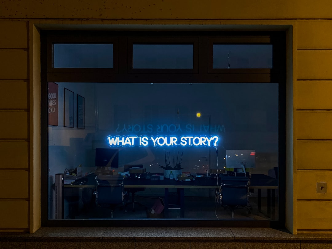
Pro Tip: If a sign requires explanation when you stand next to it, it is probably too subtle for real wayfinding. Clear is not the enemy of beautiful; clear is what makes beautiful usable.
Pre-print checklist
Confirm all dates, times, venue names, floor numbers, accessibility details, sponsor logos, and URLs. Check spelling for names and community terminology carefully, especially if they are part of the exhibition’s cultural center of gravity. Verify contrast, margins, and minimum type sizes in the final exported file. Then print a test sheet and inspect it under the same lighting where it will live.
On-site checklist
Walk the route as if you were arriving for the first time, and do it with no staff assistance. Note where you naturally hesitate or wonder whether you are in the right place. Test whether directional signs are visible from the distance people actually travel. If there is a QR code, make sure the code is large enough and placed where phones can scan without awkward crouching.
Promo checklist
Make sure every public-facing graphic includes a clear path to the next action: buy, RSVP, read more, arrive, or share. Your copy should also work as alt text or a caption excerpt if the design is separated from its original context. Keep one version focused on attendance and another focused on culture or education, especially if partner organizations will share it. This modular approach resembles the planning discipline used in participation-data growth strategies and regional brand-strength planning.
8) Metrics, Feedback, and Continuous Improvement
Inclusive design is strongest when it is tested against behavior, not just taste. The good news is that you do not need a huge research budget to learn what is working. Simple observation, staff feedback, audience questions, and post-event forms can reveal where signage, promo assets, or accessibility notes are falling short. If you are willing to iterate, every exhibition becomes a research cycle that improves the next one.
What to measure
Look at practical indicators such as repeated directional questions, missed entrances, QR scan rates, social save/share rates, and comments about accessibility. If people keep asking the same question, the answer probably needs to be more visible in the design. If a promo post gets lots of engagement but low attendance, your message may be aesthetically strong but operationally unclear. The goal is not vanity metrics; it is trust and usability.
How to gather feedback respectfully
Ask staff and visitors for input in ways that do not burden them. A short post-event form, a brief volunteer debrief, or a wall note card can surface valuable patterns. If the event serves marginalized communities, be mindful of asking too much from people already doing emotional labor. Keep feedback channels optional, concise, and actionable.
Iterate like a living archive
Queer exhibitions often draw on archival memory, and your design system can function like a living archive too. Save successful layouts, sign sizes, copy variants, and accessibility notes so you are not rebuilding from scratch each time. In practice, that makes future events faster, cheaper, and better. The same long-term thinking appears in maintainer-style playbooks and analytics monitoring habits.
9) Common Mistakes to Avoid
Even experienced teams make predictable errors when they are moving quickly. The most common one is treating inclusivity as a theme rather than a workflow. Another is over-designing the promotional layer and under-designing the actual visitor experience. A third is failing to distinguish between assets that persuade, assets that inform, and assets that guide movement.
Don’t prioritize aesthetic consistency over usability
A flawless Instagram grid does not help if guests cannot find the accessible entrance. A visually rich poster does not help if the text is unreadable in the hallway light. Always ask whether the design is serving the moment it appears in. If not, simplify or split the content into multiple assets.
Don’t hide practical details in captions only
Accessibility notes, wayfinding instructions, and venue specifics should appear inside the design whenever possible. Relying on captions assumes people will read the post in the right order and that platforms will display all text equally. They will not. Important information deserves direct visual placement.
Don’t let cultural relevance become insider-only
You can be specific without being exclusionary. If your exhibition references community history, include enough context for newcomers to follow the thread. The best queer-facing design welcomes insiders and first-timers at the same time. That balance is what creates reach without dilution.
10) How to Apply the Leslie-Lohman Mindset in Practice
The Leslie-Lohman approach, as reported in the context of the museum connecting collection-building to the basic needs of the city’s queer community, suggests a powerful principle: institutions should not separate cultural stewardship from community service. Applied to graphics, that means the design system is not merely an announcement vehicle. It is an access tool, a hospitality tool, and a cultural translation layer. When you design from that mindset, your work becomes more than promotional. It becomes part of the exhibition’s public care.
Design as mutual aid for attention
Queer communities are often navigating information overload, housing insecurity, scheduling constraints, and accessibility barriers at the same time. Clear design respects that reality. It helps people spend less time decoding and more time deciding. In that sense, every legible sign and every well-structured promo asset is a small act of mutual aid for attention.
Institutional memory should support community memory
If the exhibition lives at a museum or archive, the graphics should not feel like a locked system only staff can navigate. Instead, they should invite the public into the cultural memory being preserved. That can mean using archival references responsibly, naming the people and movements represented, and connecting wayfinding to the narrative of the show. The more the design reflects the archive’s living context, the more visitors can locate themselves within it.
Creativity and accountability can coexist
Some of the most compelling exhibition identities come from constraint. Accessibility requirements can sharpen the concept by forcing clearer decisions about hierarchy, contrast, and copy. Community accountability can also prevent shallow symbolism and push the work toward deeper authenticity. If you treat constraints as part of the creative brief, you will usually arrive at a stronger result.
Frequently Asked Questions
1. What makes exhibition graphics “inclusive” rather than just attractive?
Inclusive exhibition graphics help people understand, navigate, and participate without unnecessary friction. They combine legibility, contrast, clear hierarchy, culturally specific language, and useful accessibility details. Attractive design is valuable, but inclusive design proves its value when real visitors can actually use it.
2. How do I make wayfinding useful for visitors who are new to queer spaces?
Use a consistent directional system, keep labels simple, and place signs where decisions happen. Include entrance cues, restroom directions, quiet spaces, seating, and accessibility notes in the most visible hierarchy. New visitors should not need to ask staff for basic navigation.
3. Should every promo asset include accessibility information?
Yes, when space allows, it is best practice to include at least the most relevant access details in the design itself. If full details do not fit, include a clear pointer to where people can find them. Accessibility should be visible, not hidden.
4. How can I avoid cliché “rainbow branding”?
Start with the actual content, histories, and communities represented by the exhibition. Use color and symbolism only when they are meaningfully connected to the story you are telling. Specificity is more convincing than generic visual shorthand.
5. What is the fastest way to test if a sign works?
Print it at actual size and ask a person who did not design it to follow the instructions from a realistic distance. If they hesitate, ask questions, or miss the point, revise the hierarchy. A quick hallway test will reveal more than a polished mockup.
6. How often should I update exhibition graphics after launch?
Update them whenever visitor behavior suggests confusion, or if details such as hours, access, or room assignments change. Treat the system as living documentation rather than a one-time deliverable. Small updates can prevent major frustration.
Conclusion: Make the Graphics Part of the Welcome
Inclusive exhibition graphics are at their best when they do three things at once: guide the body, respect the culture, and reduce the effort required to belong. For queer spaces, that is not a bonus feature. It is the design brief. When your wayfinding is clear, your promo assets are honest, and your visual system is built around the audience’s real needs, you create more than an exhibition identity. You create a public invitation that feels thoughtful, legible, and worth accepting.
If you are building your next asset set, treat accessibility as the starting point, not the final check. Revisit your poster hierarchy, room signs, social tiles, and access notes with the same rigor you would bring to a curatorial wall text. For more practical frameworks on how to shape assets that travel well across channels, you may also find it useful to review building a social-first visual system, cross-device workflow lessons, and analytics during beta windows. The stronger your design system, the more confidently your audience can enter, explore, and return.
Related Reading
- The Museum Breathing Life Into New York’s Downtown Performance Scene - A useful lens on how institutions can connect collecting with community needs.
- Sacred Retail: Using Dua and Spiritual Signage to Elevate Muslim-Owned Boutiques - Shows how signage can carry cultural meaning and trust.
- Designing a Frictionless Flight: How Airlines Build Premium Experiences and What Commuters Can Borrow - A smart reference for reducing friction in visitor journeys.
- Building a Social-First Visual System for Beauty Brands (That Scales for Small Teams) - Helpful for creating flexible promo asset systems across platforms.
- Overcoming Perception: Data-Driven Insights into User Experience - Useful for measuring whether your graphics truly improve usability.
Related Topics
Avery Morgan
Senior SEO Content Strategist
Senior editor and content strategist. Writing about technology, design, and the future of digital media. Follow along for deep dives into the industry's moving parts.
Up Next
More stories handpicked for you

Museums as Community Studios: Applying Leslie‑Lohman’s Model to Creator Collectives

Navigating AI: How to Ensure Your Content is AI-Approved

Surviving Evolving Landscapes: Why Retaining Old Maps Can Benefit Creative Spaces

Behind the Curtain: The Thrill and Challenges of Launching a Theatre Production

Visualizing Transition: The End of an Era in Metal with Megadeth's Final Album
From Our Network
Trending stories across our publication group

Score to Story: How Using Underrated Classical Music Can Elevate Your Video Content

Reproductions, Replicas, and Revenue: Launching a Limited Edition Based on Historical Works (Legally)

Calm in the Chaos: Utilizing Visual Content in Conflict Resolution

From Wheel to Wireframe: What Pottery Teaches Us About Ethical AI for Creatives

Parade-Worthy DIY: Creating Costume and Prop Asset Kits for Creators and Influencers